
What Is A First Page Design?
A first-page design is the visual representation of the cover or opening page of a document, website, or any other piece of content.
It is the first impression that a reader or viewer gets when they come across a particular piece of information.
A well-designed first page can captivate the audience's attention and entice them to explore further.
It sets the tone for the content and gives a glimpse into the overall style and aesthetics that have been used throughout the document or website.
A first-page design is crucial for creating a positive user experience and establishing a strong brand identity.
In this article, we will explore the key elements and principles of a first-page design and discuss how it can be optimized to create a compelling and visually appealing introduction to any content.
Benefits Of A Good First-Page Design
A well-designed cover page can instantly grab attention, giving the reader an immediate positive impression of the content within.
Apart from making a strong first impression, a well-designed cover page also adds a personal touch to the assignment.
This personal touch can make the assignment feel more authentic and engaging for the reader.
Using hand-drawn illustrations on the cover page helps to create a sense of artistry and originality. Handwritten typography adds a touch of personality and warmth.
Collage presents an opportunity to combine various images and elements in a creative and visually striking way.
Watercolor, with its soft and flowing nature, brings a sense of calmness and beauty to the design.
Design Elements For Creating A Great Cover Page
In this article, we will explore some key design elements that can help you create an impressive and impactful cover page for any project or assignment.
1. Visual Elements: One of the most important design elements for a cover page is the use of visual elements.
This can include images, illustrations, or even abstract designs.
Visual elements should be chosen carefully to reflect the theme or topic of the project, as well as to catch the reader's attention and create a visually appealing composition.
2. Typography: Typography plays a significant role in the overall design of a cover page.
Choosing the right fonts and arranging them creatively can enhance the aesthetics and readability of the page.
It's important to consider the tone of the project and select fonts that complement the theme, whether it's professional, playful, or elegant.
3. Colors: Colors are powerful tools for conveying emotions and setting the mood. The use of a well-chosen color palette can greatly impact the overall impression of the cover page.
Whether you opt for bold and vibrant colors or a more subtle and muted scheme, make sure that the colors harmonize with the content and create a visually cohesive design.
4. Composition: The arrangement and placement of various design elements on the cover page determines its overall composition.
Pay attention to the balance, hierarchy, and flow of the elements to create an aesthetically pleasing design.
Consider using grids, spacing, and alignment techniques to achieve a well-balanced and visually appealing composition.
Color Palettes And Choosing Colors
Here's why color palettes and careful color choices are important:
Firstly, using a color palette helps maintain visual consistency and brand identity. If the project is associated with a brand or company, it's recommended to select colors from their established brand guidelines.
This creates a cohesive look and reinforces the brand's visual identity.
Secondly, color psychology plays a vital role in creating the desired emotional impact. Different colors evoke different emotions and moods.
For example, warm colors like red and orange can stir up excitement, while cool colors like blue and green can evoke a sense of calmness.
By understanding color psychology, you can choose colors that align with the content and evoke the intended emotions in your audience.
When selecting colors for a cover page, consider a few key tips. It's best to stick to a maximum of three shades to avoid overwhelming the design.
Ensure high contrast between the background and text to ensure readability. Experiment with different font colors for headings and subtitles to create visual interest and hierarchy.

Fonts And Typography
The choice of fonts can greatly impact readability, accessibility, usability, and overall graphic balance.
It's important to select fonts that align with the overall tone and message of the content.
Here are some tips for font selection on a first-page design:
1. Readability is key: Choose fonts that are easy to read, especially when it comes to body text.
Avoid overly decorative or intricate fonts that can strain the reader's eyes.
2. Stick to a limited number of fonts: Using too many different fonts can create visual chaos and make the design look cluttered.
Limit yourself to 2-3 fonts that work well together and create a cohesive look.
3. Consider flow and harmonization: Think about how the fonts flow together and complement each other.
Aim for a harmonious balance between different font styles, sizes, and weights.
4. Contrast for emphasis: Use contrasting typography to create visual interest and hierarchy.
Combine different font weights, sizes, or styles to highlight important elements or create a focal point.

Visual Identity And Logo Placement
Incorporating branding elements such as color, font, and brand personality can enhance the overall design by creating a consistent and recognizable look.
Color, for instance, can evoke specific emotions and convey the brand's identity. Font selection is equally important, as it helps reinforce the brand's tone and message.
By aligning these elements with the brand's visual identity, the cover page design becomes an extension of the brand itself.
Its size should be balanced with other design elements to create visual harmony.
Positioning the logo strategically, such as at the top or in a corner, ensures it is immediately visible and captures attention.
Integration with other design elements, such as illustrations or text, should be seamless and enhance brand recognition.
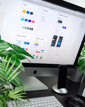
Images, Graphics, And Illustrations
Images, Graphics, And Illustrations are crucial components of a captivating cover page design.
These visually appealing elements not only add depth and interest to the overall layout but also play a significant role in attracting readers.
Incorporating logos of the author and the publishing company on the cover page adds a professional touch and establishes a sense of credibility.
By carefully selecting graphics and illustrations that complement the theme or subject of the book, the cover page can capture the reader's attention and intrigue them to explore further.
Vibrant and eye-catching visuals create an immediate impact and make a lasting impression.
Logos, whether it's the author's brand or the publishing company's identity, act as instantly recognizable symbols that convey the book's association and endorsement.
Placing the logos strategically ensures maximum visibility and helps readers identify and connect with the content.
Adding relevant images and graphics not only enhances the aesthetic appeal of the cover page but also provides visual cues about the genre or content of the book.
By choosing illustrations that reflect the book's theme, the cover design becomes a powerful marketing tool that entices readers to delve into the pages within.
Layout And Composition
A well-designed layout takes into consideration the placement of images, graphics, and text.
These elements should be strategically positioned to create a harmonious composition that attracts the reader's attention and communicates the essence of the book.
When it comes to the placement of images, the cover page design should feature visuals that are relevant to the book's content or genre.
Strategically placing these images can entice potential readers and give them a glimpse into what the book has to offer.
Fonts, sizes, and colors should also be carefully selected to ensure that they align with the overall design aesthetic.
Creating a balanced composition is also important for a visually appealing cover page.
This involves considering the distribution of elements, such as images, graphics, and text.
Achieving balance can be done through symmetry, asymmetry, or a combination of both, depending on the desired effect.
Professionalism And Minimalism
Professionalism and minimalism are crucial elements in designing a first page that effectively conveys the essence and impact of the content.
A clean and minimalistic design not only enhances the visual appeal of the page but also creates a sense of professionalism.
A minimalistic approach eliminates unnecessary clutter and distractions, allowing the key elements to stand out.
This simplicity creates a strong visual impact and draws the reader's attention to the most important aspects of the page.
It also reflects a level of professionalism and seriousness, giving the impression that the content is well thought out and meticulously crafted.
To achieve professionalism and minimalism in first-page design, several key design principles should be considered.
Using a neutral color palette, such as shades of white, gray, or black, creates a clean and sophisticated look.
An organized layout with ample white space enhances readability and makes the page look polished and professional.
High-quality images can play an important role in minimalistic design by adding depth and visual interest without overcrowding the page.
Carefully selected and placed images contribute to the overall professionalism of the design.
Tips On Creating An Effective Cover Page Design
Here are some tips to help you create an effective cover page design.
1. Understand the Purpose: Before starting the design process, clearly define the purpose and target audience of the document.
This will guide your design choices and ensure that the cover page accurately reflects the content within.
2. Keep it Simple and Clean: A clutter-free design with a minimalistic approach is often the most effective.
Avoid overcrowding the page with unnecessary elements and instead focus on showcasing key information concisely.
3. Make it Visually Appealing: Utilize well-chosen images, graphics, or illustrations to enhance the visual appeal of the cover page.
Ensure that they are relevant to the content and align with the overall tone and style of the document.
4. Pay Attention to Typography: Select fonts that are easy to read and convey the desired tone and message.
Use font sizes, styles, and typography hierarchy to create visual interest and guide the reader's attention.
5. Maintain Consistency: Align the design elements of the cover page with the overall branding and visual identity of the document or organization.
Consistency in colors, fonts, and formatting will create a cohesive and professional look.
6. Test and Revise: Once the cover page design is complete, seek feedback and make necessary revisions.
Test the design across different devices and platforms to ensure compatibility and optimize its visual impact.
Keep It Simple And Eye-Catching
Keeping the design simple allows for better memorability and readability, while eye-catching elements capture the reader's attention and make the cover page stand out.
One way to achieve an eye-catching design is by using attention-grabbing visuals. Incorporating unique images or illustrations that evoke curiosity or intrigue can instantly captivate the reader.
These visuals should be relevant to the content and convey the intended message effectively.
In addition to visuals, the use of typography and color can also contribute to an eye-catching design.
Choosing fonts that are easy to read but have personality can add visual interest to the cover page.
Similarly, using a color palette that complements the visuals and reflects the tone of the content can help create a memorable and eye-catching design.
When designing a cover page, remember to keep it simple and avoid overcrowding with unnecessary elements.
Focus on showcasing key information in a concise and visually appealing way.
Think About The Audience
Tailoring the design to their specific interests and aesthetic choices can significantly enhance the impact of the cover page.
For instance, selecting colors that resonate with the audience can greatly enhance their visual experience.
It is important to avoid colors that may be disliked or associated with negative emotions by the audience.
By understanding their preferences, you can ensure that the color choice supports a positive and engaging first impression.
This includes the ability to adjust colors to align with the desired visual impact. With just a few simple modifications, the cover page can be transformed to align perfectly with the target audience's taste.

Incorporate Your Branding
When designing the first page, it is crucial to incorporate your branding elements to establish a strong and cohesive visual identity.
By seamlessly integrating your logo, color palette, and font choices into the cover page, you can create a lasting impression on your audience.
The presence of your logo on the cover page instantly communicates your brand's identity and helps in building brand recognition.
Ensure that the logo is prominently placed and sized appropriately to grab attention.
Choosing colors that align with your brand's visual identity is equally important.
Use your brand's color palette on the cover page to create a sense of familiarity and consistency.
This will not only enhance brand recognition but also evoke specific emotions and associations related to your brand.
Font selection also plays a vital role in branding. Align the font used on the cover page with the typography you regularly use in your brand materials.
This consistency will reinforce your brand's voice and style.
To add your logo or branding text to the cover page, utilize the Branding & Text panel.
This feature enables you to easily upload your logo and customize its placement and size.
Additionally, you can input branding text, such as your company name or tagline, and modify its formatting to match your desired style.
Use High-Quality Images And Graphics
When it comes to designing the first page of your document, using high-quality images and graphics is of utmost importance.
Visuals have the power to enhance the overall look and feel of the cover page, making it unforgettable and catching the reader's attention.
This makes the first impression more impactful and ensures that readers immediately understand what your document is about.
Simplicity and uniqueness are also key factors in a successful cover page design. High-quality visuals help achieve this by providing clean lines and crisp details.
Simple yet eye-catching imagery stands out and is more likely to leave a lasting impression on the reader.
Moreover, high-quality images and graphics effectively convey the message you want to communicate.
Whether it's a striking photograph, a well-designed illustration, or an impactful infographic, visuals have the power to evoke emotions and tell a story.
They can communicate the tone, theme, and purpose of your document even before the reader delves into the actual content.
Make Sure It’s Easy to Read And Understand
When it comes to designing a cover page, readability and clarity are crucial elements that should not be overlooked.
A well-designed cover page is not only visually appealing but also ensures that the information is easily understood by the audience.
By selecting clear and easily readable fonts, you ensure that the message is communicated effectively.
Clear headings are also essential for guiding the reader's attention and understanding of the content.
Headings should be bold, distinguishable, and positioned in a way that allows for easy scanning.
This enables the reader to quickly grasp the main points and navigate through the cover page effortlessly.
By incorporating elements and visuals that are familiar and appealing to the target audience, you increase the chances of capturing their attention and interest.
This ensures that your cover page reaches the right audience and aligns with their search intent.
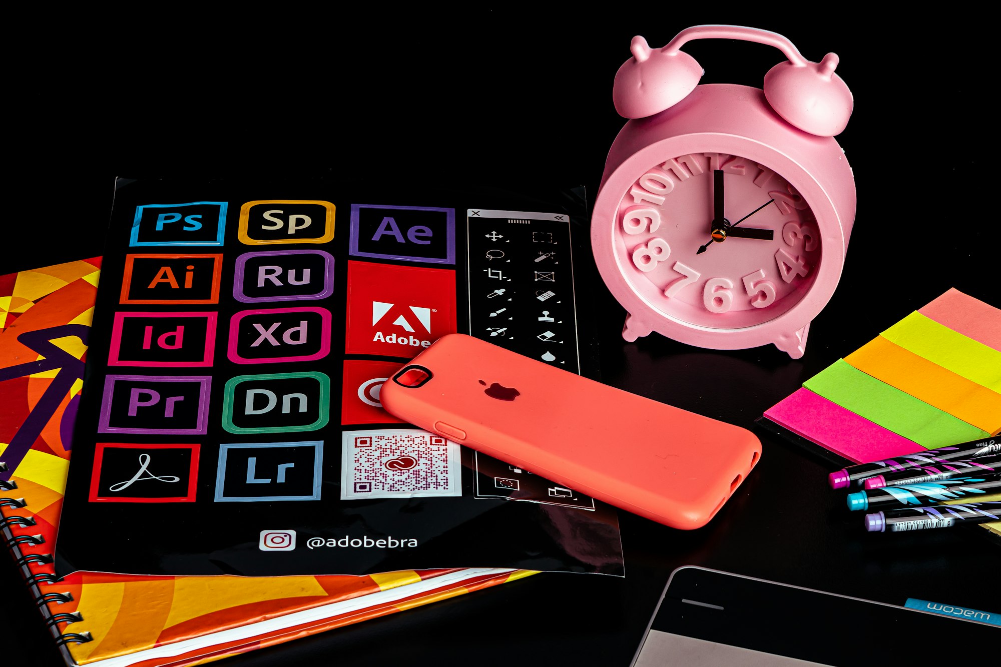
Design Tools For First Page Design
Here are some popular tools that can be utilized for this purpose:
1. MS Word: MS Word is a widely used word processing software that offers a range of design features.
While it may not have extensive design capabilities, it is suitable for creating basic front-page designs with text, images, and colors.
2. Adobe InDesign: Adobe InDesign is a publishing tool that allows for complex front-page designs with multiple pages.
It offers advanced typography, layout control, and integration with other Adobe software like
Photoshop and Illustrator, making it ideal for creating visually stunning designs.
3. Canva: Canva is a user-friendly web-based design tool with a wide selection of templates and design elements.
It is suitable for creating both basic and more intricate front page designs, as it offers a range of customization options and easy drag-and-drop functionality.
4. Microsoft Publisher: Microsoft Publisher is a desktop publishing software that allows for the creation of professional-looking front page designs.
It offers a variety of templates, fonts, and design tools that are suitable for both simple and complex projects.
5. GIMP: GIMP (GNU Image Manipulation Program) is a free and open-source image editing software.
While primarily an image editing tool, it can also be used to create unique front-page designs by combining various elements and applying artistic effects.
6. Figma: Figma is a cloud-based interface design tool that allows for collaborative design projects.
It is suitable for creating front-page designs with a focus on user experience and interactive elements.
7. Sketch: Sketch is a vector graphics editor used primarily for designing user interfaces.
It offers a streamlined and intuitive interface, making it suitable for creating visually appealing and modern front-page designs.
8. Affinity Designer: Affinity Designer is a professional-grade vector graphics design tool.
It offers advanced features for creating complex front-page designs with high precision and control.
Final Thoughts
Throughout this article, we have explored various tools such as MS Word, Adobe InDesign, Canva, Microsoft Publisher, GIMP, Figma, Sketch, and Affinity Designer.
These tools offer different features and functionalities that allow for the creation of visually appealing and professional cover pages.
However, the design process should not end with the completion of the cover page. Gathering feedback from users and stakeholders is crucial in evaluating the effectiveness of the design.
First Page Design FAQ
Why is a good first-page design important?
A good first-page design sets the tone for your document or project, capturing the reader's attention and conveying the purpose and essence of the content within. It creates a positive first impression and enhances the overall user experience.
What are the essential elements to include in a first-page design?
Key elements to include are a visually appealing layout, a title or heading that reflects the document's topic or purpose, relevant images or illustrations, and any necessary branding or identity elements such as company logos.
How do color palettes and typography contribute to first-page design?
Color palettes can create visual interest and evoke specific emotions or moods. Typography choices, such as font styles and sizes, enhance readability and reinforce the document's overall design aesthetic.
Any tips for creating an effective first-page design?
Keep it simple and uncluttered, using a minimalist style. Ensure the design aligns with the content's purpose and target audience. Consider the use of whitespace, balanced composition, and hierarchical organization of information.